
Unveiling a modern identity for the Friends of the Fisher Library at the University of Toronto
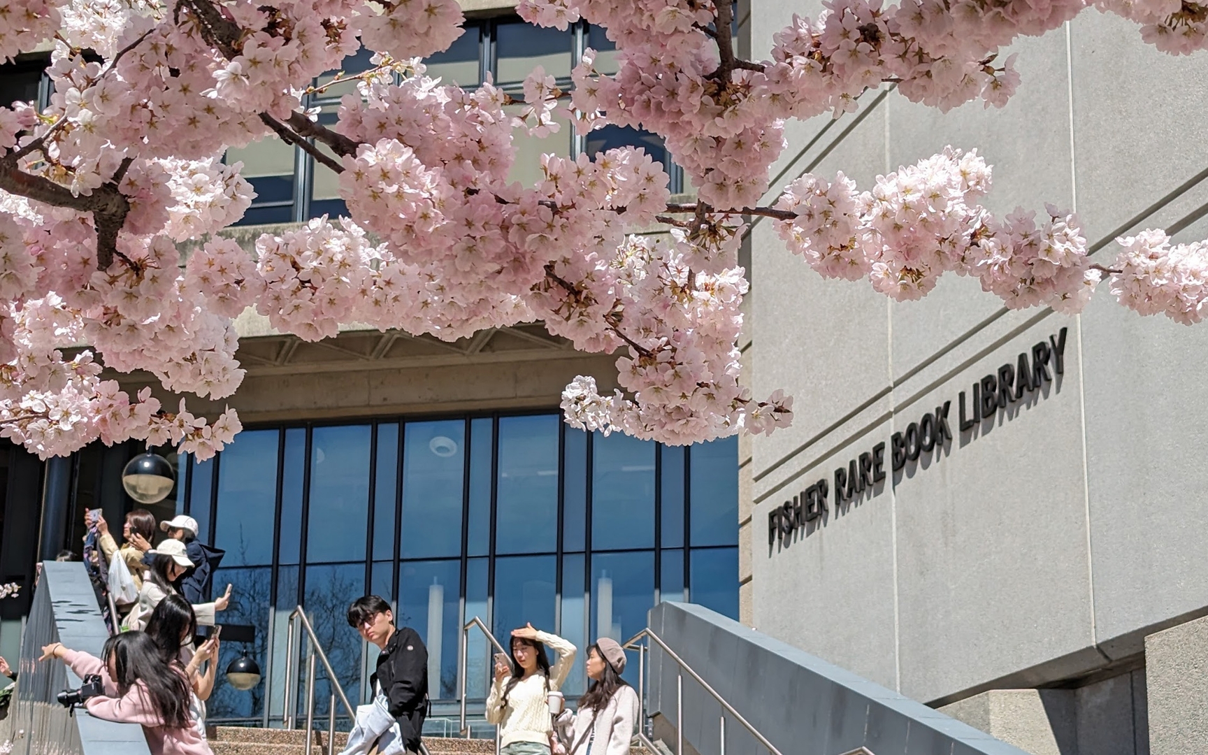
A cornerstone of the University of Toronto’s heritage, the Friends of the Fisher Library champions the preservation of the books at the Thomas Fisher Rare Book Library, which is home to materials from across Canada and around the world.

- Industry
Education
- DeliverablesBrand MarkConceptsDiscovery

Challenge
Despite their longstanding dedication to preserving our literary history, the Friends of the Fisher Library lacked a visual identity to reflect their profound impact.
Hyphen's Approach:
Hyphen’s aim was to create an identity that would embody the spirit of the Thomas Fisher Rare Book Library and the Friends of the Fisher Library organization.
Our approach was to create a design that was both structured and elegant, conveying a sense of community while remaining clean and multifaceted – a symbol suitable for a forward-thinking and progressive group of supporters.
Goals:
- Reinvigorate the Friends of the Fisher Library brand to appeal to a younger demographic of future donors
- Enhance their presence across the University of Toronto network and more broadly across Canada
- Help drive interest and fundraising efforts to preserve Canadian heritage and history around the world
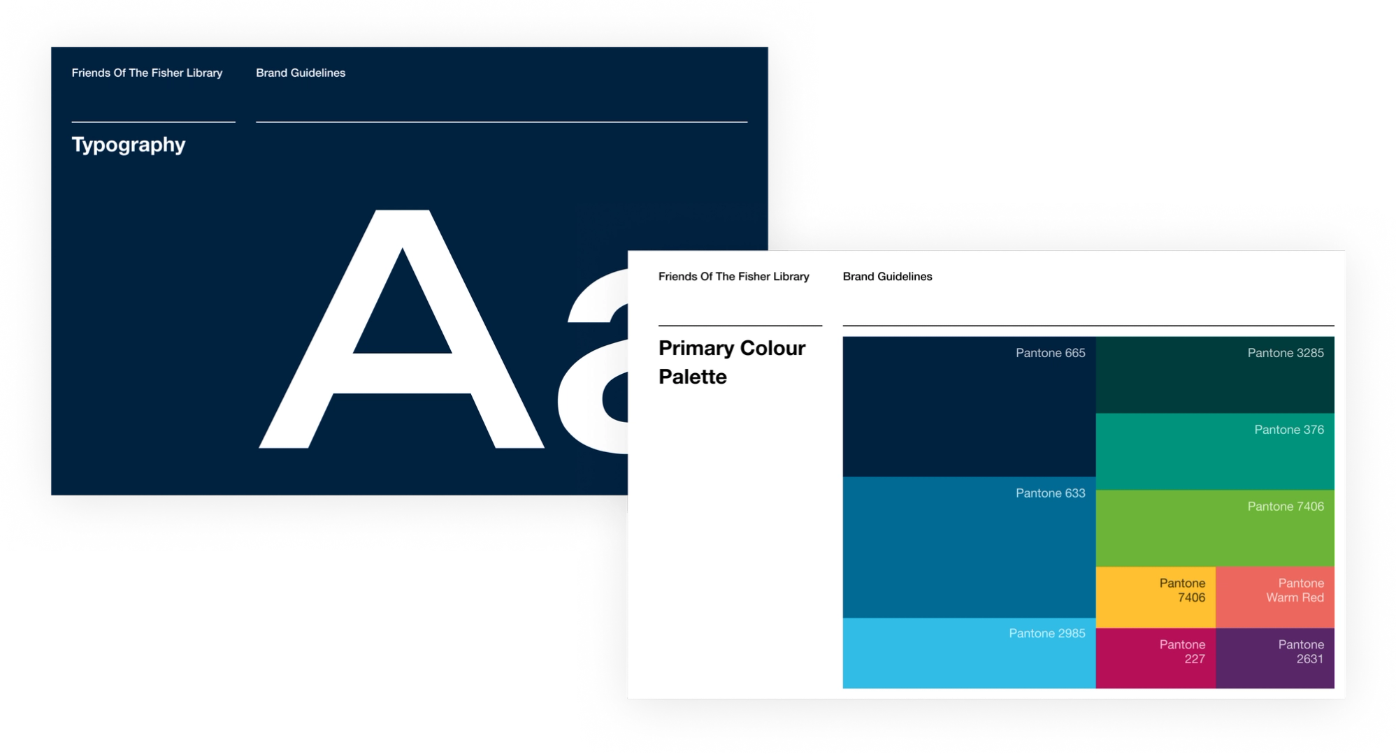
Aligning with Existing Standards
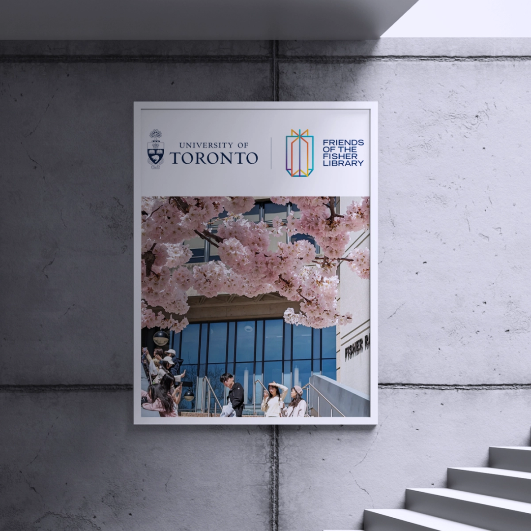
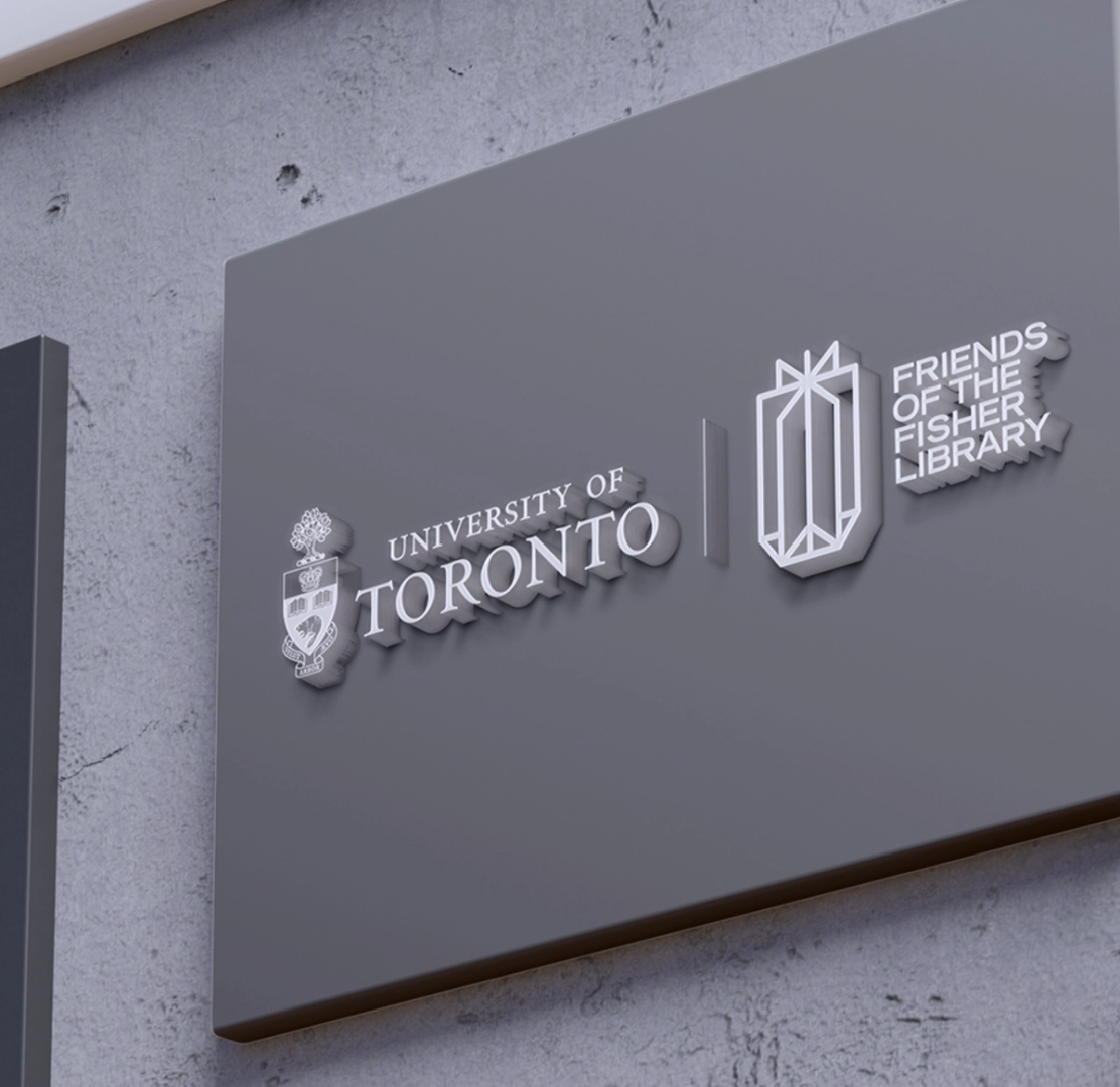
Respecting and following the University of Toronto’s existing brand treatments meant that we were restricted to colourways, fonts, and a horizontal lockup.
We enjoy the challenge of working with specifications and restrictions. Rather than hampering us, they offer room for creative exploration and growth.
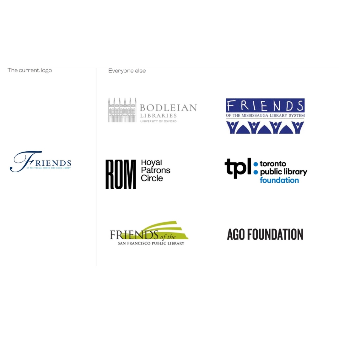
Assessing the Landscape
Research is an important part of any creative project we take on.
We conducted a review of other brand marks to help inform our work and understand the visual environment in which the new Friends of the Fisher Library brand mark would exist.
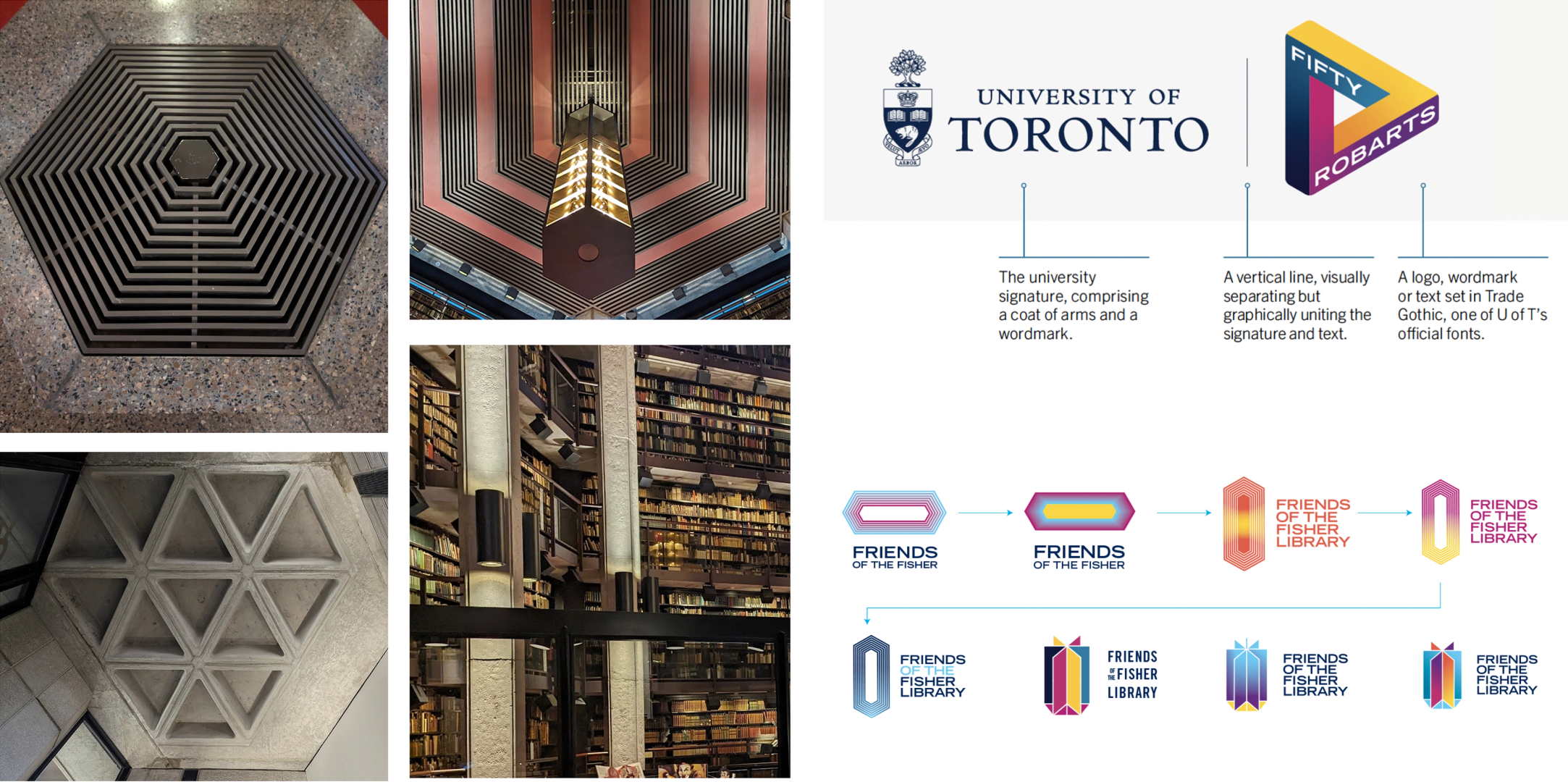
Finding Inspiration & Evolution of the Brand Logo
The Thomas Fisher Rare Book Library is a striking space tucked away in the University of Toronto’s Robarts Library.
We were inspired by the brutalist triangle design with hexagonal wings for the Fisher Library and its unique hanging lighting fixtures, which ultimately became the basis of the logo itself.
The chosen brand mark is set in a hexagonal base, symbolizing stability and derived from the architectural form of the Fisher Library.
From this base, sheet-like panels extend upward, reminiscent of pages turning in an open book, creating a sense of aspiration and exploration.
“Top quality design and experience working with Nat, Richard, Tamar and the whole team at Hyphen.”

Executive Director, Creative Integrated Marketing Communications, University of Toronto